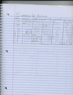
These are my 5 sketches for the business card. My company (E-Bladez) is an electric rollerblade product that can get people from point A to point B with little to no effort by the user. For each sketch, I made sure to include the basic title along with information about the company such as email, web, phone and address.
This is the brochure sketch for my project. I laid out each page individually and talked about the product on most of the pages. The brochure will be a combination of pictures and text all relating to E-Bladez.
These are my sketches for the letterhead. For these I decided to keep it as simple as possible. I most likely will end up varying these from their original design, but the overall concept will remain the same
Monday, November 25, 2013
Sunday, November 17, 2013
Corporate Identity Questionaire
1) What is your business?
We make electric-powered roller blades
2) Describe your business in one sentence
We make professional grade blades for people of all skill levels and ages
3) Who is your target audience?
Kids, teenagers, young adults, adventurists, extreme athletes, skaters
4) Who are your competitors?
Blind, Circa, Alien Workshop, Rollerblade, Etnies, DC
5) What makes them better/worse than your product/service?
Blind primarily focuses on skateboards and decks; Circa, DC, and Etnies are more geared toward there apparel; Alien workshop neglects roller blade
6) Do you currently have an identity? (This is more for companies that are already established and you’re just revamping the logo/corporate identity. If you have a new company or product, skip this question.)
Why is this important: If you’re an established company with a well-known logo, you may not want to deviate too extremely from it.
7) (If your answer to #6 is no, skip this question) What do you like about it and what don’t you like about it?
Why is this important? Even if you plan to change the logo entirely, it’s good to keep an inventory about what specifically worked and didn’t work about your previous design in order to inform the new one.
These following questions might seem silly, but their purpose is to help generate ideas.
1) How do you want your image to be seen in two years?
I want this company to be seen nationwide at large skating events and one day the X Games
2) If your company was an animal, what animal would it be and why?
A gazelle because with our electric rollerbaldes, not only can you move automatically, the option to ride manually is still available, allowing for speed, shiftiness, and sharpness like never before
3) If your company/brand was a person, who would it be and why?
Shaun White, because he is an extreme skater who can ride just about any board or skates and represents the youth of skating today
4) If your company/brand was an object, what would it be?
Electric Roller baldes (E-Bladez)
5) If your customer was a cartoon character, who would it be?
Otto from RockerPower, an extreme cartoon about young kids doing extreme sports
Monday, November 11, 2013
Lyrical College
I used many layer masks and used various selection tools to get each character cropped out of there respected original photographs. The flames were copied multiple times to string them across the bottom screen and tweaked with a slight glow and an element of smoke was added for realism. The text includes many layer style effects and was darkened to help it fit in more with the color correction of the picture. Usually I would make the title brighter, but not for this particular project. I don't consider the title the most important part of this image, more so the rappers.
Monday, November 4, 2013
Custom graphic
 |
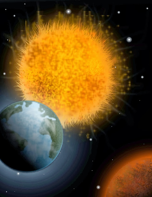
For this graphic, I used a lot of brush artwork to create a realistic solar system. I created my own brush pattern for the earth shapes and made sure to include many gradient overlays in my shapes. I was able to get pretty nice glow effects without using too many preset Photoshop effects. For some reason the glow effects are exaggerated and too strong on this version of my image, but the overall effect remains the same. For the sun rays I used the grass brush then added a glow along with the smudge tool and streaks from other brushes with lower opacity
Subscribe to:
Posts (Atom)


