Monday, November 4, 2013

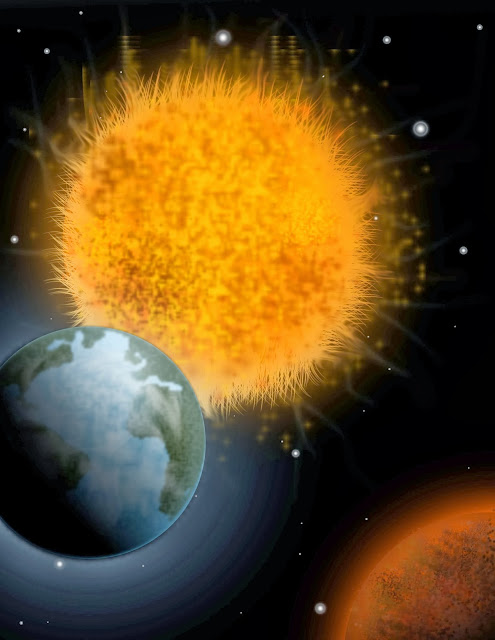
Custom graphic


 For this graphic, I used a lot of brush artwork to create a realistic solar system. I created my own brush pattern for the earth shapes and made sure to include many gradient overlays in my shapes. I was able to get pretty nice glow effects without using too many preset Photoshop effects. For some reason the glow effects are exaggerated and too strong on this version of my image, but the overall effect remains the same. For the sun rays I used the grass brush then added a glow along with the smudge tool and streaks from other brushes with lower opacity

Wednesday, October 30, 2013

In this assignment, I made use of the skewing options in the free transform tool. By Adding many gradients and brushes, I was able to achieve a glowing sign effect featuring myself on the billboard. I added simple text "just do it" and the signature nike check, and before I knew it, I had a nike sponsored poster

Wednesday, October 23, 2013


For this project I decided to outline LeBron James. I used many layers of vector art and made sure to keep every layer named and organized. I incorporated many reflections and bright sports to help give definition to the muscle tone by simply drawing white shapes and blurring them while lowering their opacity. Gradients played a huge role in making this piece pop. There is a gradient on just about every portion of this illustration, from the background to the sneakers. I used a gradient mesh on the shirt and the face, and added shadows in the ceiling to give it that 3d effect.

Wednesday, October 9, 2013

Here are my 5 logo sketches for my product, E-Bladez, the worlds first electric rollerblades

Monday, October 7, 2013

This is the logo i decided to choose for my fictional company. This product, E-Bladez is a revolutionary product that will revolutionize the way we get around. For the design, I decided to go with a simpler approach by focusing more on the text/typography rather than an actual logo illustration. I want the text alone to be recognizable enough too not need a graphic. I simply just took a simple text (Impact) and converted it to a graphic. Then I placed a thin stroke around the text and used the 3d bevel effect give it that 3-dimensional appearance. I then had to outline the path of the stroke to restore the line that was originally there but was hidden because of the 3d effect. By placing a gradient on the 'Z' I was able to show movement with the flames at the tail end which helps represent the motion of the product.